



Learvo
Product designer at an ed-tech startup turning student notes into quizzes, flashcards, summaries, and mnemonics.
The Gist: New users landed on an empty dashboard. Returning users hit an inconsistent nav and a quiz screen with no real signal. I redesigned both and shipped the code myself.
Oct 2025 to Present (Sep 2026) · Product Design Intern · 7 min read
- ROLE
- Product Design Intern (design + frontend implementation)
- TEAM
- Learvo, product designer shipping directly into a live codebase
- SCOPE
- Landing page, onboarding activation, navigation system, quiz review UX
Highlights
Judgment calls, not just visual polish. Every section leads with the decision, not the checklist.
Replaced a cold, empty first session with a guided flow tied to real backend generation state
Designed an activation nudge that decays on its own instead of nagging long-term users forever
Shipped one consistent nav system across 5 pages while merging through 121 diverged commits
Cut a fake "streak" feature rather than ship engagement numbers with nothing real behind them
4
features designed and shipped
5
core pages unified under one nav system
Timeline
Oct 2025
Lenny, the Mascot
Designed Lenny, Learvo's mascot, starting with sketches and landing on the final character design used across the product.
Dec 2025, ongoing
Doodle System
Started designing Learvo's hand-drawn doodle system, extended over time into preset profile avatars and more illustration touchpoints.
June 2026
Landing Page Redesign
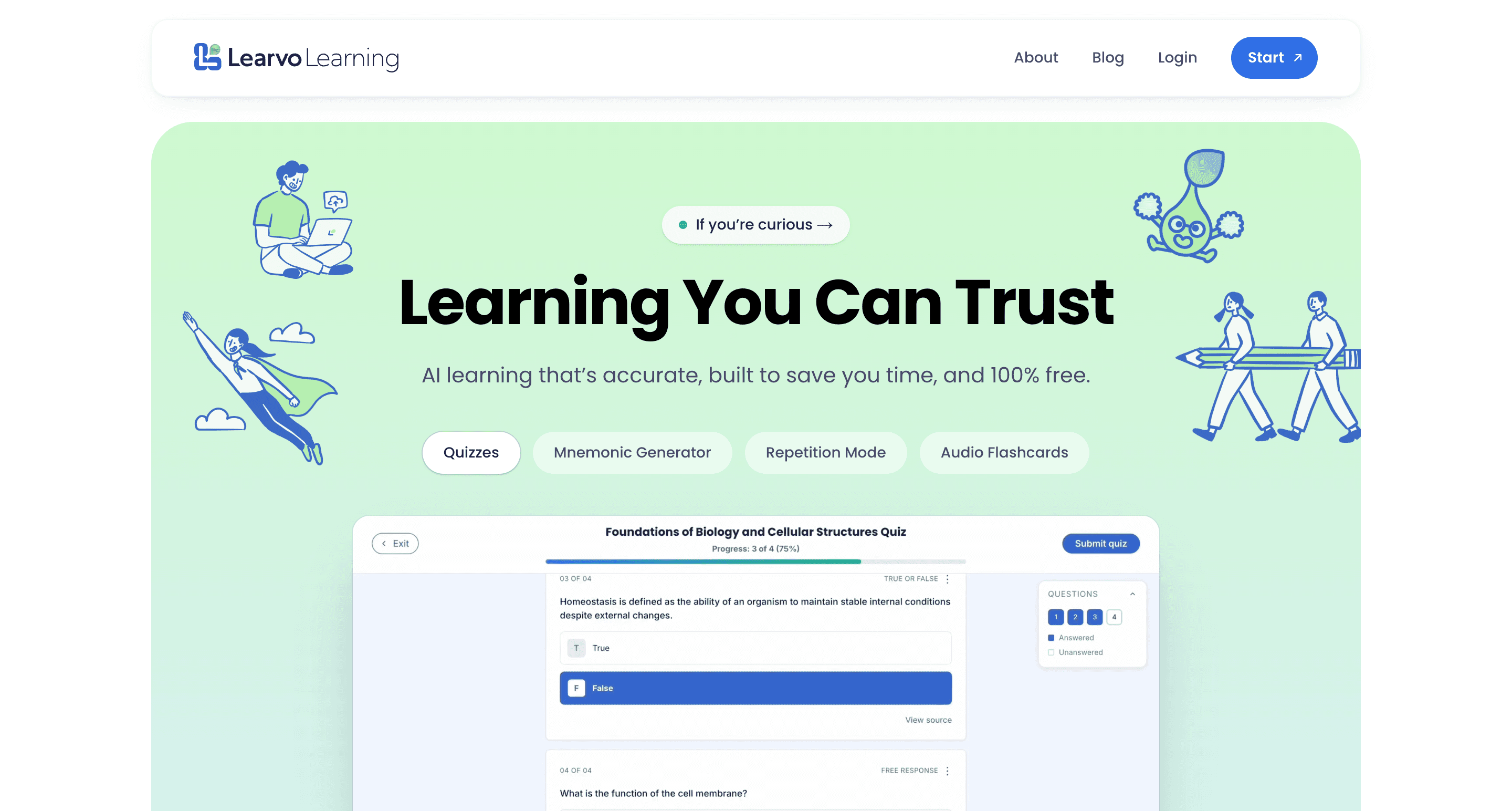
Redesigned the marketing landing page to reinforce Learvo's brand identity at the first touchpoint a new user sees.
July 2026
Onboarding Checklist
Designed a persistent, decaying activation nudge for the 4 core actions, built to fade out for users who've already activated.
Sep 2026
Onboarding Quiz Flow
Shipped the guided upload, goal, customize, generate flow, replacing the empty first-session dashboard.
My Role & Impact
Problem
Learvo's real competition isn't other study apps, it's chatbots: fast answers with no guarantee they're accurate. The product bet is that a student's own class notes, not AI-generated guesses, are the more trustworthy source, and the design problem was making that trade feel just as fast. On top of that, new users landed on an empty dashboard with nothing to do, and returning users hit an inconsistent nav and a quiz status system that was often invisible.
Solution
A guided first-session flow backed by real generation state, an activation nudge with built-in decay, one consistent top nav across the app, and a quiz review system that replaced encouragement copy and fake streaks with real, data-backed status.
Impact
I shipped the code myself, so every decision had to survive a real, changing codebase. I learned Git and opened pull requests across frontend and backend, working directly with engineers instead of handing off static designs.
What I Shipped
Landing Page Redesign
Problem: The old page read as a generic, gradient-heavy "startup website" with no color, mascot, or brand identity. Analytics showed most visitors never scrolled past the fold, so the product's value never reached them.
The Call
College students decide in seconds whether a study tool is worth their time, usually while stressed or between classes. I led with speed over a feature list and restructured the page around one promise: turn your notes into a quiz or flashcard deck almost instantly.
- Brand identity replaced generic gradients: Rebuilt the page around Learvo's palette, Lenny, and the doodle system so it reads as built for college students, not a generic SaaS template.
- Copy rewritten around a real pain point: Reframed messaging around not spending money and not losing study time, instead of generic productivity language.
- Structured navigation, not a hope-they-scroll page: Added a hero CTA to the value section, a second CTA to the FAQ, and a sticky nav CTA, so value is reachable from anywhere on the page.
Impact: Rebuilt the page around getting a busy, skeptical student to the value proposition fast.
View the live landing pageOnboarding Checklist
Problem: Users needed a persistent nudge to complete 4 core actions (upload, quiz, flashcards, summary), not just a one-time push at signup.
The Call
A checklist that never goes away is a nag, not a nudge. I built in decay on purpose: visible for a user's first 4 visits, gone for good on visit 5. Growth wanted persistence; I traded some completion pressure for not annoying users who'd already moved on.
- Two dismiss states, not one: The X dismisses for the current session and returns next time. It's only gone for good after visit 5, so an accidental close doesn't cost the nudge entirely.
- Cross-page completion tracking: Progress persists across pages via a shared store, instead of resetting per page.
- Collapsed variant for tablet: A waving-hand icon with a notification badge keeps the nudge alive on smaller viewports without eating layout space.
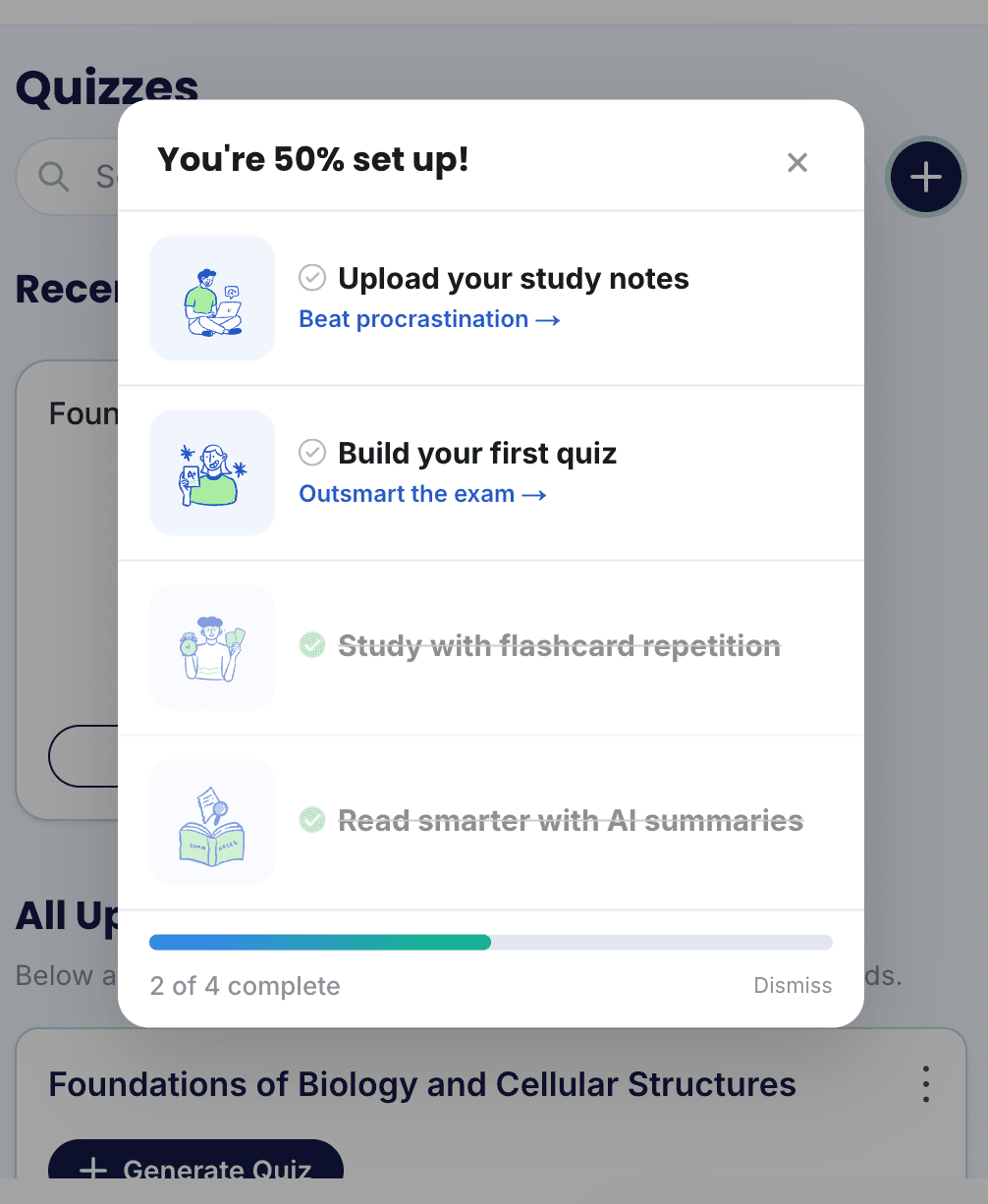
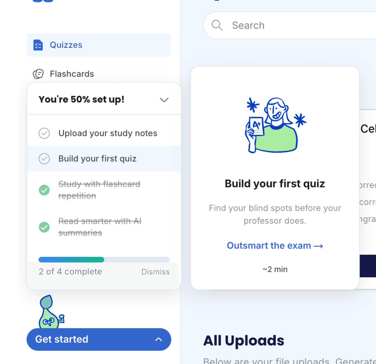
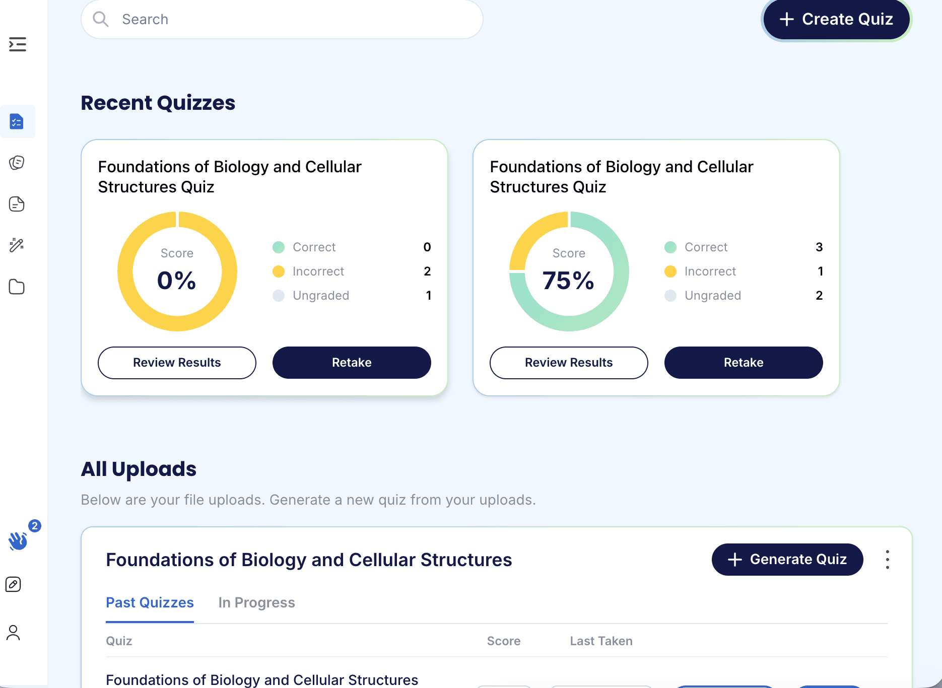
Impact: An activation nudge built to lose the argument with itself over time, driving early engagement without becoming permanent nagware.
Top Nav
Problem: The old nav had no page identity, emoji placeholders instead of real avatars, a buggy Pomodoro timer, and no sensible mobile layout for timer, feedback, and profile actions.
The Call
This was a scope call under pressure, not just a nav redesign. The branch had diverged 121 commits from main while other teams shipped global search, an ambassador program, and a quiz tutorial in the same window. I rebased by hand rather than ask for a freeze, since blocking three features to land one redesign wasn't a fair trade.
- One nav system, 5 pages: Flashcards, Library, Quizzes, Summaries, and Generator each get a page title and a per-page action slot instead of a generic shared header.
- Real avatars, not emoji: Preset avatars plus custom upload replaced emoji placeholders in the profile.
- Mobile got its own layout, not a squeeze: A feedback icon replaces the timer in the mobile top bar; the timer moves to a bottom drawer, and profile becomes a keyboard-aware drawer instead of a cramped popover.
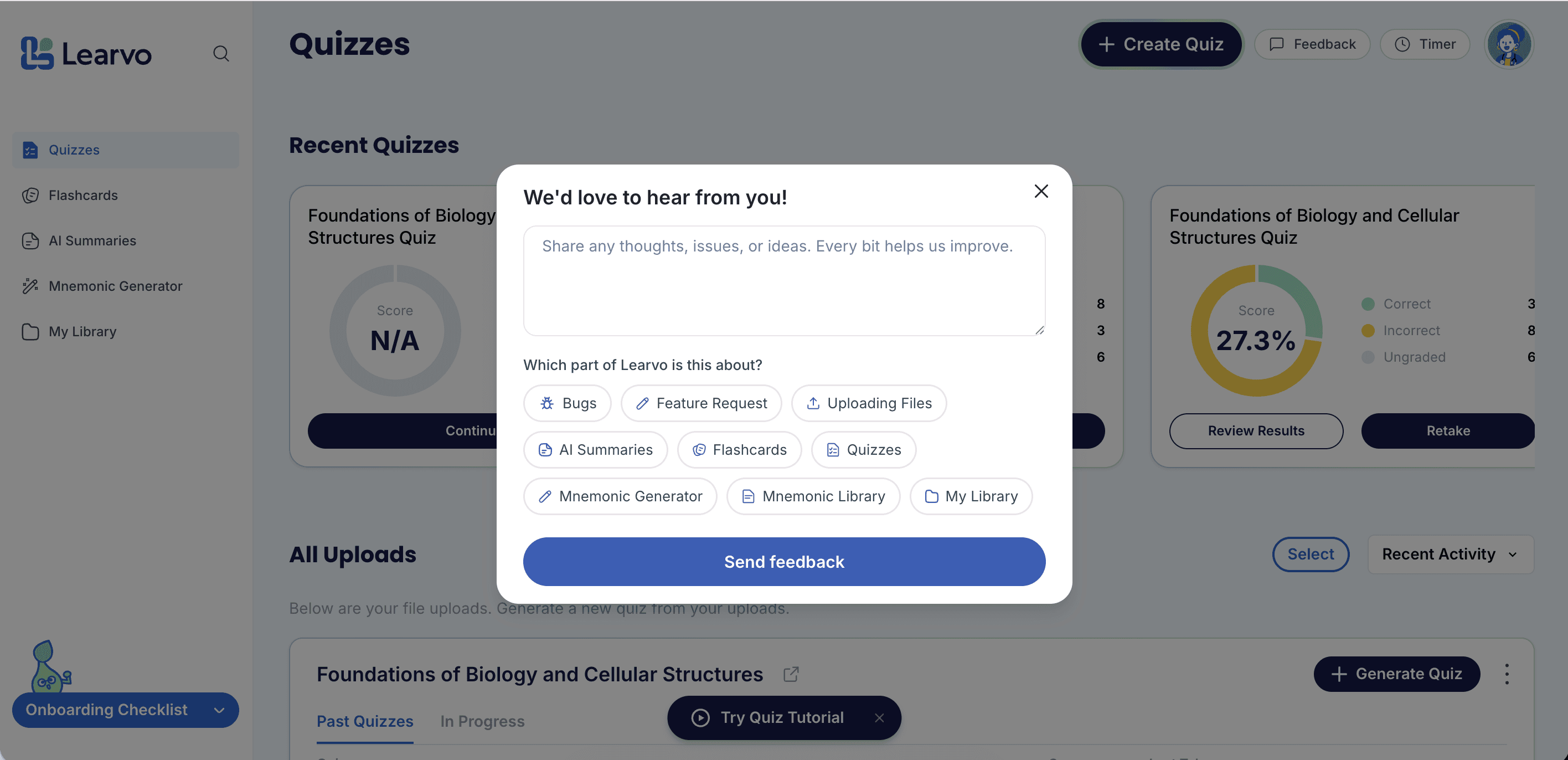
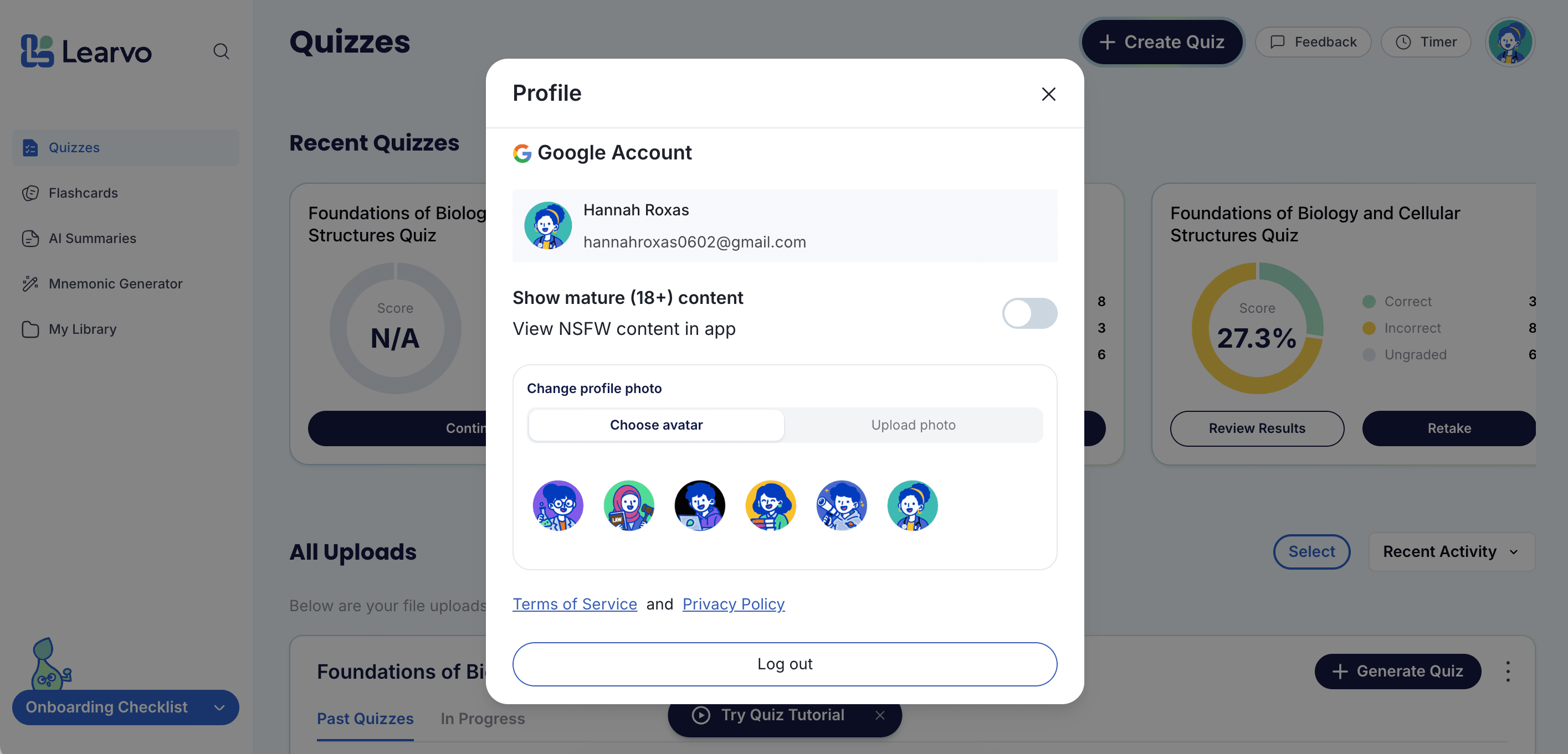

Impact: A consistent nav that shipped without blocking or regressing three other features landing in the same window, as much an integration problem as a design one.
Onboarding Quiz Flow
Problem: New users landed cold on an empty dashboard after signup. Referral tracking also broke mid-flight because signup redirected before it could settle.
The Call
The easy fix was a fake progress bar counting to 100%. I designed against that: the generation screen shows the real backend phase, and if nothing moves for 25 seconds, it says so instead of leaving the user guessing.
- Guided first session: Upload, goal selection, customization, then generation, replacing the bare dashboard new users used to land on.
- Failure handling that doesn't dead-end: Generation failures surface a "Try again" button and auto-redirect instead of an error banner with no way forward.
- Fixed the state underneath the UI: Gated the quiz behind actual fresh signup (was firing on stale sessions), routed OAuth signups into onboarding, and scoped state per-user so it can't leak on a shared browser.
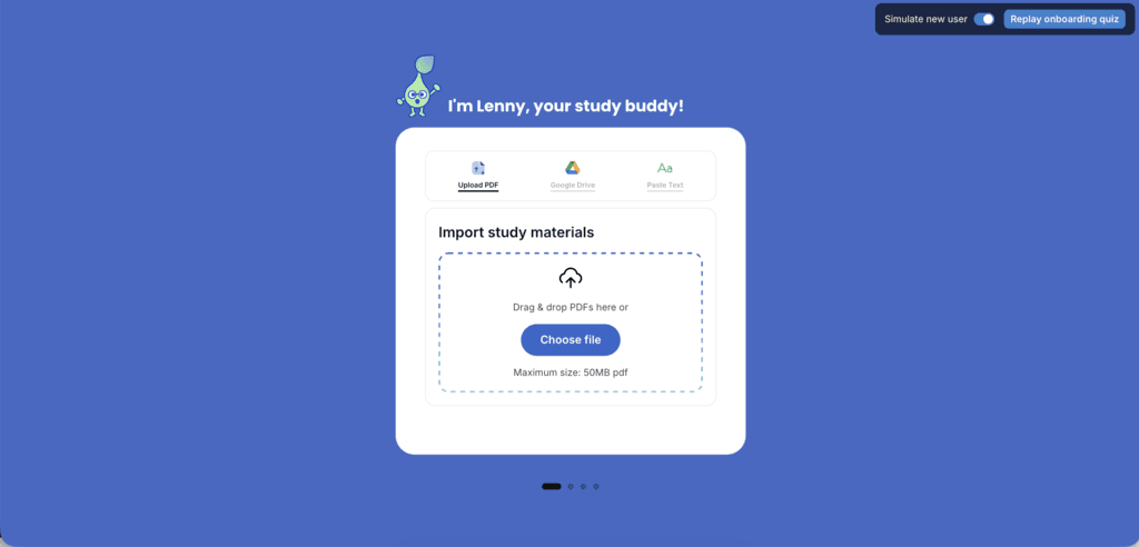
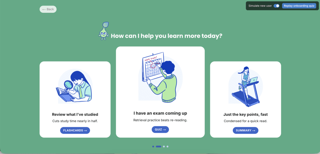
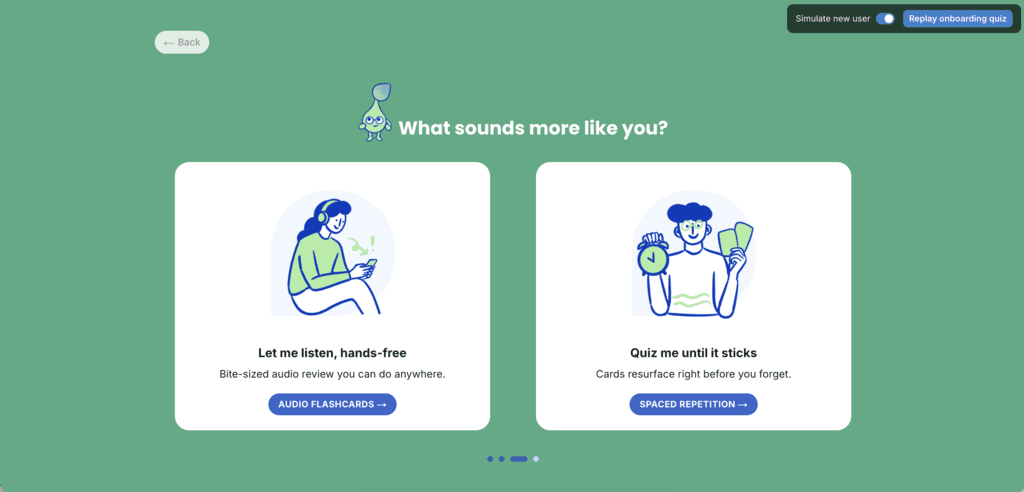
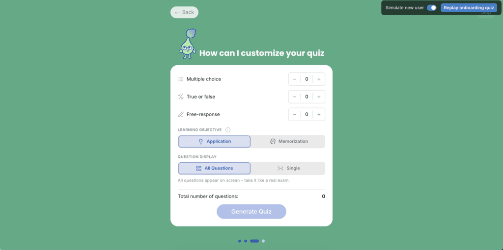
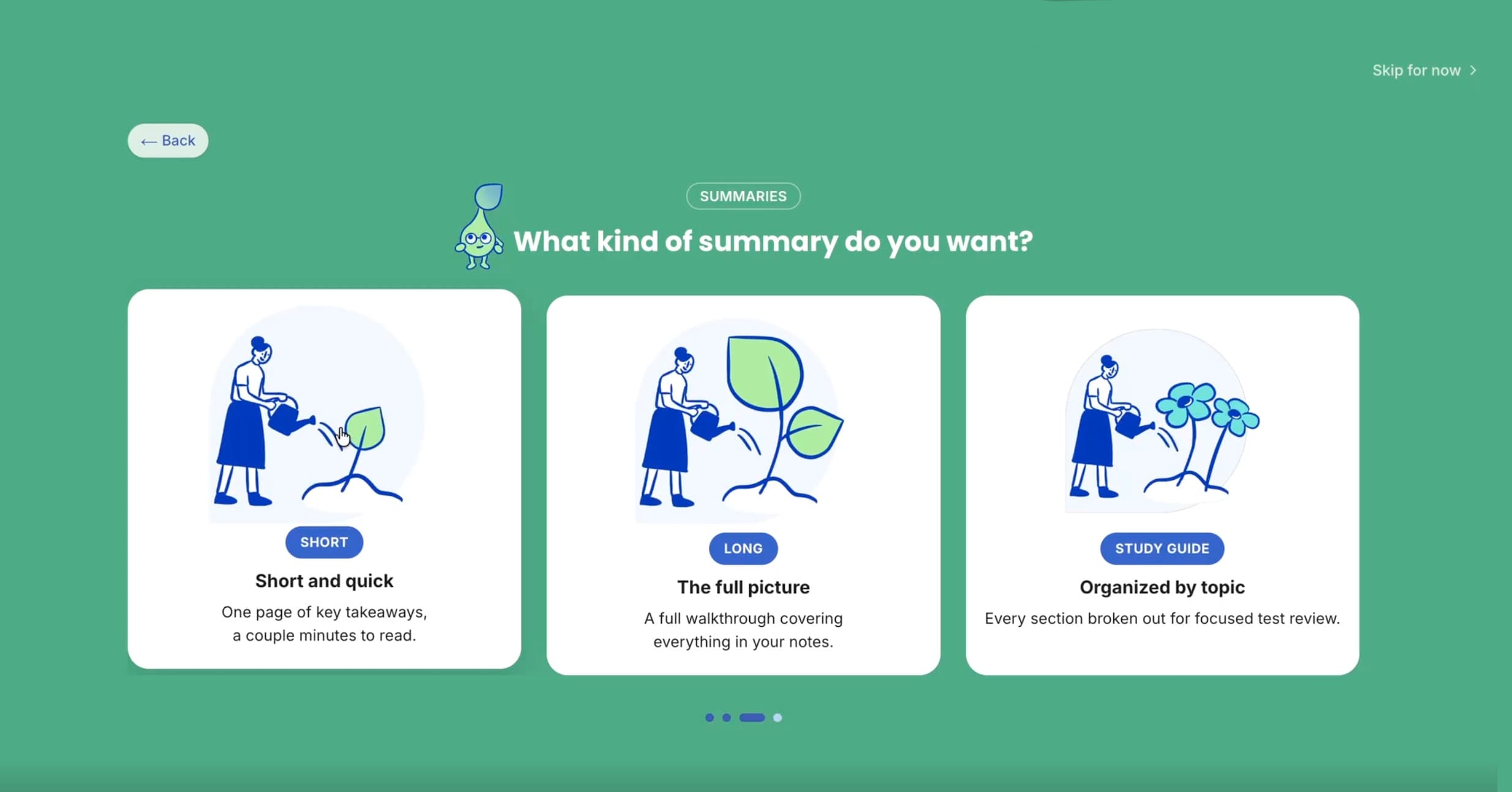
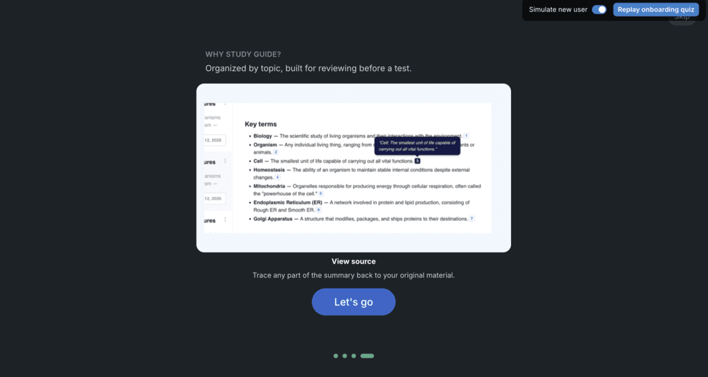
Impact: Turned a cold, empty dashboard into a guided activation flow that tells the truth about the backend, the strongest activation story here even without funnel numbers yet.
Brand Identity
Problem: Learvo's green and blue palette already existed, but wasn't showing up consistently where it mattered most: the landing page and onboarding felt disconnected from the rest of the product.
The Call
Rather than introduce a new palette, I reinforced the existing one at the highest-visibility touchpoints and designed a mascot and doodle system to carry that identity through, instead of treating brand as a logo-only concern.
Lenny, the Study Buddy
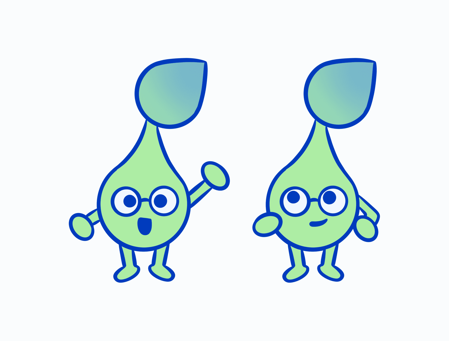
Lenny is a sprout, tying the mascot directly to the learning theme of ever-growing progress. The personality is motivational but calm, deliberately not the high-pressure energy of a Duolingo-style mascot, showing up at the exact moments new users are most likely to bounce.
Early Sketches
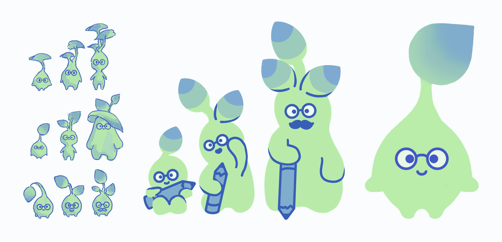
Lenny went through several rounds of exploration: proportions, expression, and how much personality the glasses and posture should carry, before landing on the final sprout design used across the product today.

Doodle System
A playful, hand-drawn doodle style used across the same first-impression touchpoints as Lenny, plus preset doodle avatars for profile customization, extending that warmth into a functional UI element.
Impact: A consistent visual identity at the exact moments a new user forms their first impression, turning an already-correct palette into one that's actually recognizable.
What I'd Do Next
- Instrument the onboarding funnel: Add step-level analytics to the guided quiz flow to replace the current qualitative impact story with real drop-off and completion numbers.
- Validate the checklist decay window: Test the visit-5 cutoff against a longer or engagement-based threshold to confirm it's not hiding the nudge too early for slower-activating users.
- Build the streak feature properly: Stand up real activity-tracking infrastructure so the "weekly streak" concept cut from the quiz card banner can come back as something honest, not decorative.
Keep Wandering
Good Friends Poke
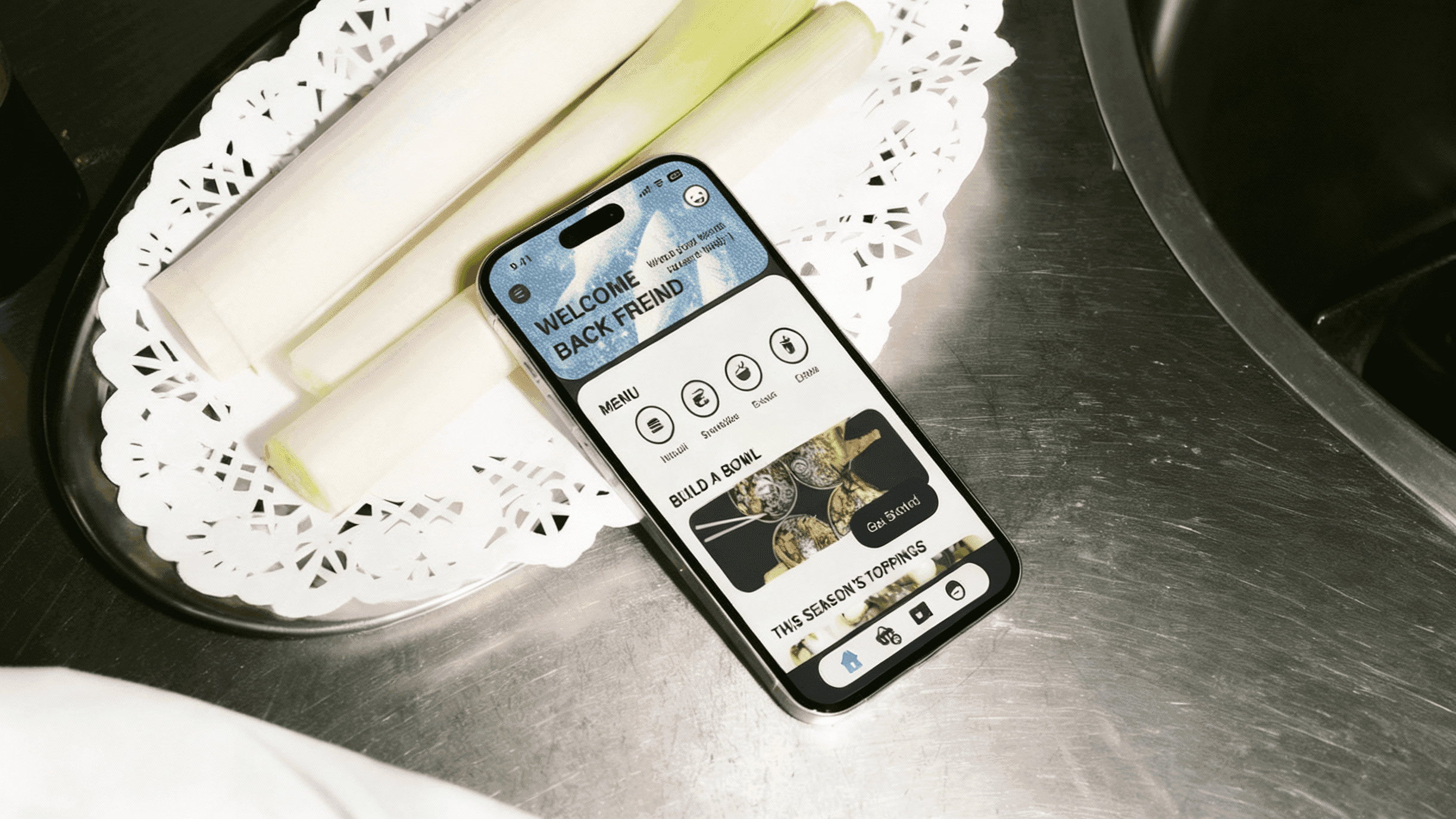
A course concept redesigning the fast-casual dining experience to reduce customer friction and peak-hour staff burnout.